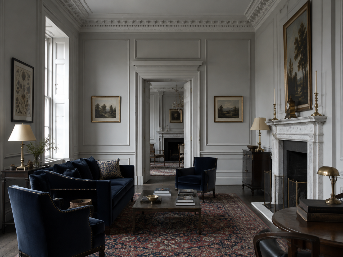
The navy in this room is not a colour scheme. It is a decision, made once, in a fortnight I would rather not relive, and then defended for four years against every subsequent good idea I have had. That is really the whole method. A sitting room can carry one grand gesture. Everything after it is housekeeping, and the housekeeping is where people lose their nerve.
What went wrong in the rooms you dislike is almost never the first choice. It is the fourth. Somebody chose a deep blue sofa — correctly, bravely — and then, worried that the room now looked underdone, added a patterned wallpaper, a mirror the size of a door, two lamps in a different metal, and a cushion in a clashing green because a magazine said the room needed a pop. The gesture did not fail. It was simply outvoted.
I. One thing loud, everything else quiet
A room has a limited budget of attention, and it is smaller than anyone admits. Spend it on one thing. Here it is spent on four pieces of navy velvet — a sofa, two armchairs, a small tub chair that nobody sits in — arranged so the eye reads them as a single dark mass rather than four separate purchases. Against pale panelling that mass behaves like furniture-shaped shadow, which is exactly what I wanted and not at all what I asked for.
Rooms are not ruined by the bold decision. They are ruined by the three timid ones taken to soften it.
The test is simple and slightly brutal. Stand in the doorway and name what the room is about. If you can say it in three words — the blue furniture, the wall of books, the window — the room is working. If you find yourself saying well, there's a lot going on, you have four gestures and no subject, and the fix is subtraction rather than shopping. This is also, incidentally, the entire argument against the feature wall: a room is not a face, and applying a focal point with a roller is not the same as having one.
II. Why navy and not black
Black furniture is a shape. Navy furniture is a shape with weather in it. In the morning this room reads slate; by six it has gone almost violet along the arms and stayed properly blue in the seat cushions, and none of that is a trick of the fabric. It is the room's north light doing what north light does, which is to take everything two degrees cooler and then leave.
There is a pleasing accident behind the colour, too. Cheap, reliable blue is a modern invention. Until the eighteenth century a strong blue meant indigo, which washes out, or ultramarine ground from lapis, which meant you were rich or painting a Madonna. Then, in Berlin around 1706, a pigment-maker named Diesbach set out to make a red lake and used potash that had been contaminated with animal matter; the batch turned pale, then purple, then a deep and entirely unexpected blue. Prussian blue — the first modern synthetic pigment, colourfast, cheap, and nobody's intention.
I think about that more than is reasonable while sitting in here. The most confident colour in the house exists because somebody's experiment failed in an interesting direction. Rooms are like that as well. The best thing in this one arrived by mistake and has been ratified after the fact.
III. The velvet, and the mistake I made in it
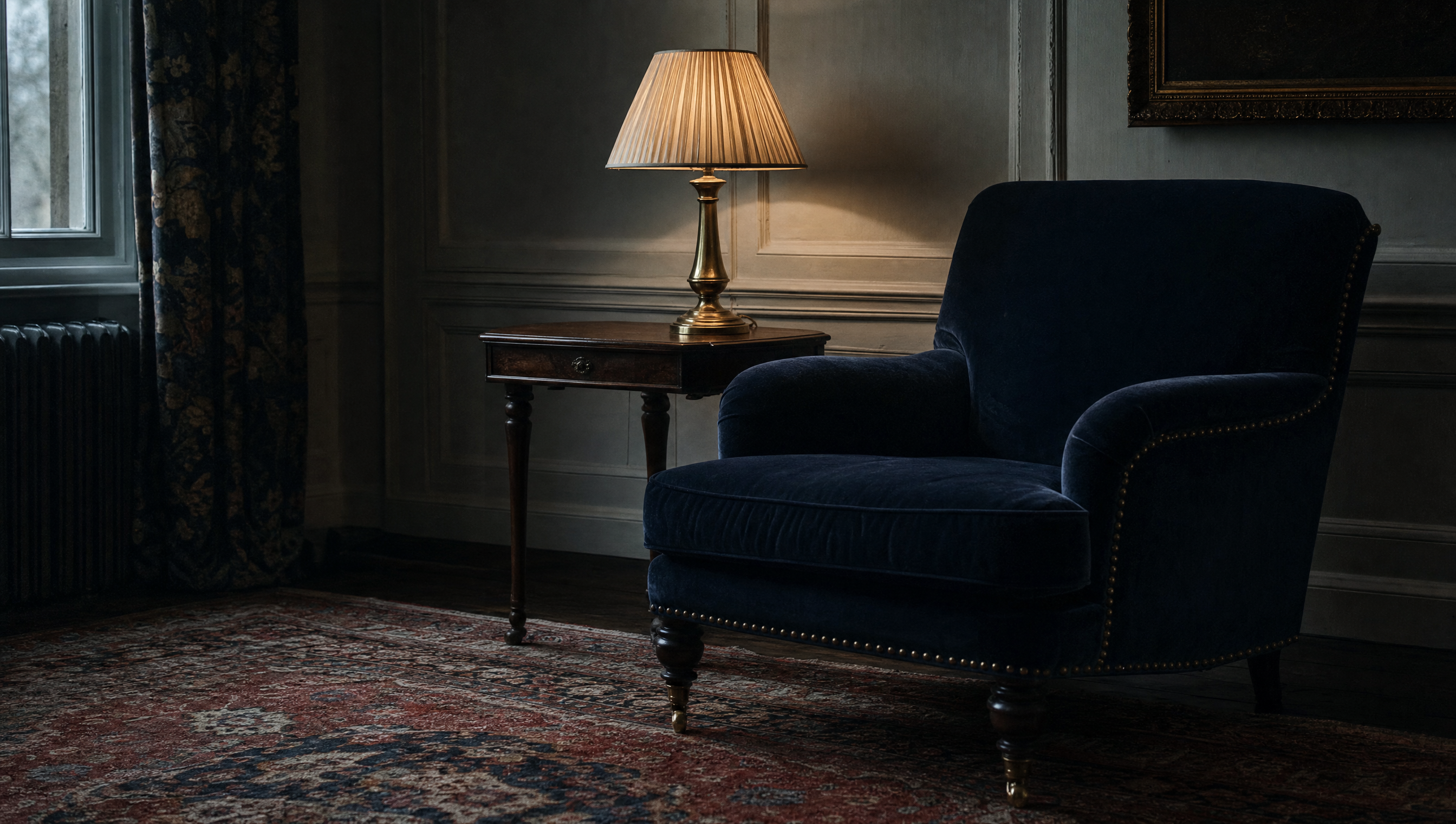
Velvet is a pile fabric, which is a polite way of saying it is thousands of cut fibres standing up in one direction and lying down the moment anything happens to them. That direction is the nap, and it is the whole character of the cloth: brushed one way it drinks the light, brushed the other it gives it back. A navy sofa is really two navies, and which one you get depends on where you are standing.
My mistake was fibre. I wanted cotton velvet, because cotton velvet is matte and soft and looks like the inside of a nineteenth-century jewel case. Cotton velvet also crushes. Sit in it for an hour and you leave a pale ghost of yourself in the seat; put a cushion against an arm and the pressure mark stays for a week. This is not a fault in the cloth — pile bruising is a normal property of velvet, and most of it lifts again with time and a little humidity — but it is a property I had not thought about while stroking a swatch in a shop.
Choose the fibre for how the room is used. Choose the colour for how the room is remembered.
So the sofa is mohair now, and the cotton lives on the tub chair nobody sits in, which is the compromise of a woman unwilling to admit a whole error. Mohair — angora goat, not sheep — has a springier, more lustrous pile that resists crushing and shrugs off dirt, and it costs what it costs for exactly that reason. Vacuum with the nap, never against it. Do not steam it in a fit of enthusiasm. Beyond that, leave it alone and let it take the shape of your household; a sofa that shows nobody has ever sat on it is not a compliment to the sofa.
IV. Brass, and one metal only
Every metal in this room is brass, and it is unlacquered, so it darkens in the corners and stays bright where hands go. That is the point. Polished brass everywhere looks like a hotel; brass left to make its own decisions looks like a house where somebody lives and occasionally reaches for a lamp switch. Mixing metals is defensible in a large room with several centres of gravity. In one room with one gesture it just reads as indecision in two finishes.
The light comes from four low sources — two table lamps, a standard lamp behind the sofa, and the fire when there is one — and never from the ceiling. I have written elsewhere about the tyranny of the overhead light. The short of it is that navy velvet under a central pendant looks like a fabric sample, while navy velvet under a lamp at elbow height looks like the inside of something. Deep colour needs light arriving sideways. It is the same lesson Soane was teaching in Lincoln's Inn Fields two hundred years ago with his mirrors and his stolen daylight: the source matters more than the quantity.
One caution, learned expensively. Warm bulbs and blue are not automatically friends. Too warm and the navy turns muddy and slightly brown at the edges, which flatters nothing. I keep everything in here at the low, candle-adjacent end and let the shades do the softening, and I change a bulb the moment it starts to feel like a filter.
V. A rug older than everyone in the room
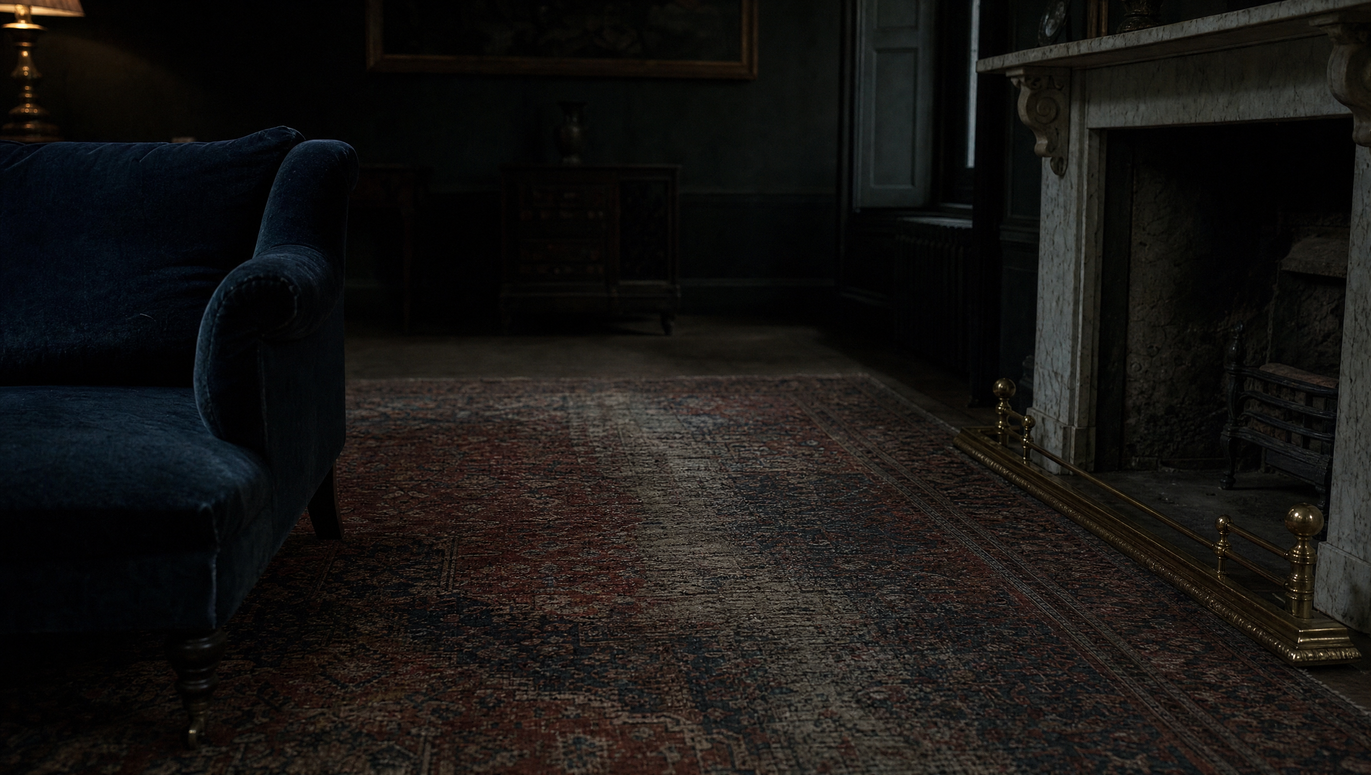
The one thing in here I did not choose for its colour is the rug, and it is the reason the room does not feel like a showroom. It is old, faded to madder and a bruised indigo, and worn nearly through along the line between the door and the fire, because a hundred years of people have taken that line and none of them were being careful. A new rug in the right shade would have matched better and said nothing.
This is not nostalgia, it is composition. New things in a room are all at the same distance from you — bought, delivered, arranged. One genuinely old thing puts the others in perspective and quietly announces that the room is not a project with a completion date. If you buy one thing at auction for a sitting room, buy the floor. Nobody bids seriously against you for a worn rug, and wear is the only quality in furnishing that cannot be manufactured, though the trade tries.
It has a repair in one corner, done badly, in a wool that does not match. I have been advised twice to have it redone properly. I have twice declined.
VI. Knowing when to stop
Here is the honest part. The room was finished in March and I went on decorating it until October. In that time I brought in and then removed: a patterned wallpaper for the chimney breast, an enormous gilt mirror that turned the room into a corridor, a pair of brass-and-black lamps that made the existing brass look like an accident, a green velvet cushion, and a second rug, laid over the first, for reasons I can no longer reconstruct.
Every one of those was a response to the same feeling: that a restrained room looks unfinished, and that the unfinished-ness is my fault and can be shopped away. It cannot. What a restrained room actually looks like is a room waiting for people, and the only thing that finishes it is somebody sitting down in it with a drink and failing to notice the walls. The wallpaper went back. The mirror is in the corridor, where it belongs, doing corridor work.
So: one gesture, one metal, light from below shoulder height, and one object older than the household. Then stop, and give it a season before you touch anything. Most rooms do not need another idea. They need the last one to be left alone long enough to become true.

Bea is a curator and writer, and keeps the Museum Directory. Arguments about the green cushion may be sent, but will not be won.
Items marked † are affiliate links. The Manor earns a small commission if you buy through them, at no cost to you, and nothing is listed here that is not already in this house.