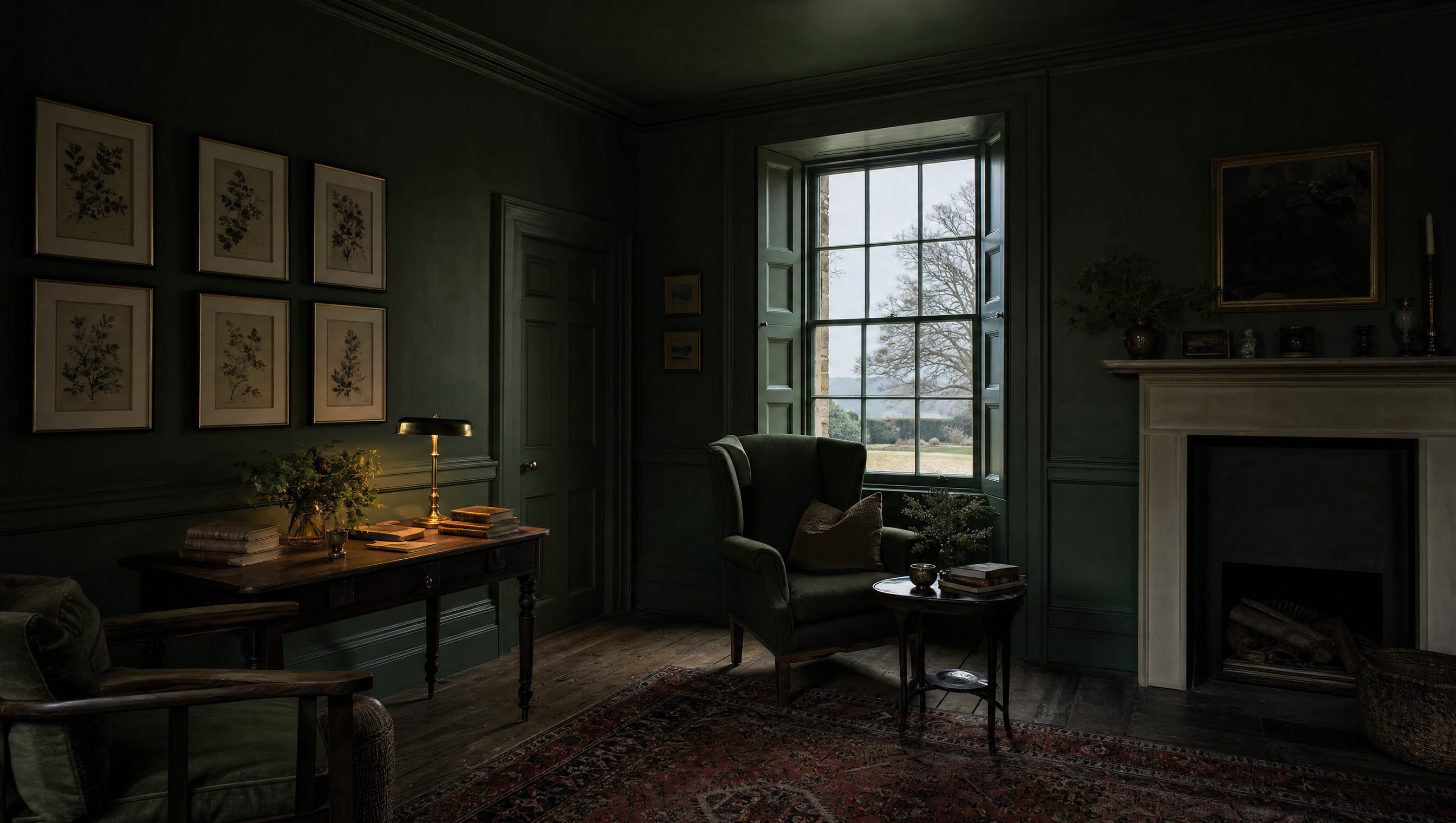
There was a feature wall in this house when I took it on. Chimney breast, first floor, a plum-ish grey the colour of a bruise going over, and three companionable magnolia walls looking at it the way a family looks at a relative who has said something at dinner. I lived with it for five months, largely out of fairness, and in all that time not one person who came into that room looked at the chimney breast. They looked at the seam where the plum met the magnolia. So did I. That is what a feature wall does: it does not draw the eye to something, it draws the eye to the edge of a decision.
I am aware this is a small hill. I have chosen to stand on it anyway, because the feature wall is not really a colour question. It is a question about whether you believe a room is a composition or a surface, and almost everything else in decorating follows from the answer.
I. Where it came from, and what it was for
The feature wall arrived in British houses by television. Changing Rooms ran on the BBC from 1996 to 2004, two days per house and a budget that would not now cover the curtains, and the single accented wall was the perfect instrument for exactly that constraint: it is a quarter of the paint, a quarter of the labour and the whole of the before-and-after. It photographs as transformation. It reads, on a small screen, as decisiveness.
Which is fine. It was a device built for a deadline, and it did its job. The trouble is that it escaped the programme and became a rule of thumb, passed on by people who no longer remember it was invented to solve a scheduling problem rather than a design one. Twenty years later I still meet the advice in its fossil form: pick a wall to be the feature. Pick a wall to be the feature of what?
It was never a design idea. It was a way of finishing a room by Thursday.
A room already has features. It has a window with light coming through it and a fireplace with a hole in the wall behind it and a door that people arrive by. These are not decorative choices; they are the reasons the room is shaped as it is. Painting one wall a different colour does not add a feature to that list. It adds a fourth party to an argument that had already settled itself.
II. A room is not a face
The whole logic rests on the focal point, which is a borrowed idea and borrowed badly. A painting has a focal point because you stand still in front of it and it has one edge and you are given no choice about where you are. A room has no such courtesy. You walk into it, you cross it, you sit down in it with your back to a third of it, you come in at night when the only thing you can see is the lamp you have just switched on. Over an evening you will see every wall and none of them for long.
A room is not a face, to be looked at from the front, with one feature made up. It is closer to a coat: you are inside it, you notice it at the cuffs and the collar, and its quality is a matter of how it is made all the way round, including the parts nobody sees.
The people who understood this best were not colourists at all. Soane made three narrow houses on Lincoln's Inn Fields into the most emphatic interior in London without once resorting to an accent wall; he did it with mirrors placed to steal daylight from two floors away, with a shallow dome that hovers on nothing you can locate, and with a run of small dark passages that exist purely so that the next room lands properly. Emphasis, done seriously, is made of light and sequence and pressure. It is not made of pigment applied to the largest flat thing available.
III. What the fourth wall does to the other three
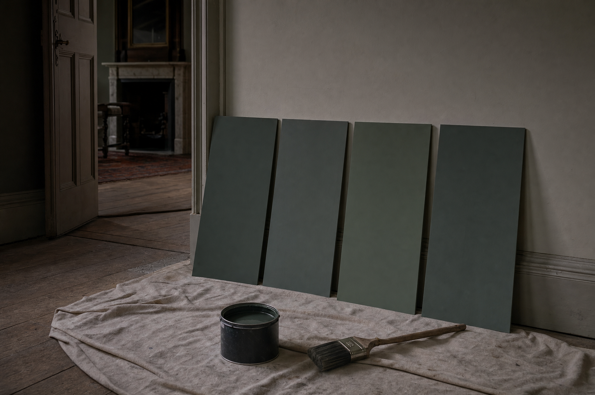
There is a practical objection underneath the aesthetic one, and it is the one that converts people. Colour in a room is not static. Light comes in, bounces off a wall, picks up that wall's tint and carries it to the wall opposite. A room with one strong wall is a room quietly tinting its three weak ones all day, and because the strong wall is the one you decided about, the three you did not decide about are the ones that look wrong. They go grey towards the corners. They look, and I mean this precisely, dirty.
Then there is the corner itself. Two colours meeting on an internal angle is the least forgiving joint in decorating: no old plaster is straight, so the line wavers, and the eye follows a wavering line the way it follows a crack. You have spent money to install a flaw at eye height and then hung a picture nearby to distract from it.
Two colours meeting on an internal corner will always tell the truth about the plaster.
And there is the confession of it. A single accented wall is legible, instantly, as a decision made three-quarters of the way. Everyone who comes into the room reads it correctly — she liked this colour but was not certain — and hesitation is the one thing a room cannot carry off. A dark room that has gone all the way is a position. A dark wall is a rehearsal that never got cleared away.
IV. The exceptions I will allow
I am not against one wall differing from its neighbours. I am against one wall differing from its neighbours for no reason the building can support. The test is simple and I apply it without mercy: is that wall already a different thing, or are you making it one with paint?
A wall of exposed brick or stone in a plastered room is already a different thing. A panelled wall in a room otherwise flat is already a different thing — the panelling casts shadow, which is a physical claim on your attention rather than a chromatic one. A papered chimney breast in a house where the paper is period and the plaster around it never was: that is repair, not styling, and I will defend it. So too the alcove painted a shade deeper than the wall it sits in, because an alcove is a hole and holes are darker; you are agreeing with the light rather than contradicting it.
What all of these share is that the difference is structural first and visible second. The feature wall reverses the order. It announces a distinction the room does not actually contain, and rooms — like people — are poor at carrying a claim they cannot back.
V. What conviction looks like instead
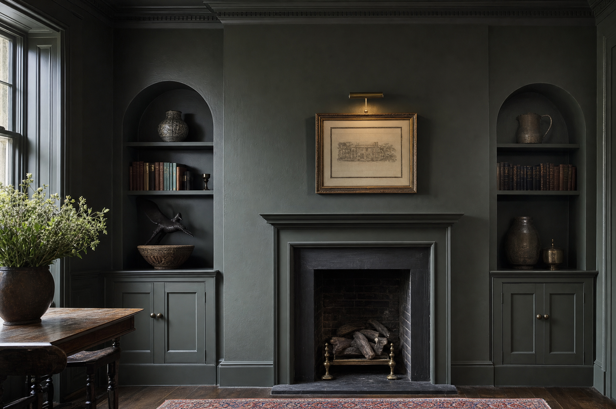
Take the colour you were going to put on one wall and put it on all four. Then keep going: the skirting, the architrave, the door, the inside of the shutters, the window reveal. Then the ceiling, which is the wall everyone forgets and the one doing most of the work, because in the evening it is the surface your lamps are actually lighting. A room drenched to the cornice does not read as loud. It reads as intended, and — this is the part that surprises people — it reads as larger, because there are no edges left for the eye to measure the room against.
Then let the emphasis come from things that can bear it. A single grand gesture in an object rather than a coating — one sofa in a fabric you cannot afford twice, and everything else quiet around it. Six low sources of light rather than one high one. Books, which are the only accent wall I have ever seen improve with age. The study here is the whole argument in one room: it is dark everywhere, so nothing in it has to shout, and the brass and the paper and the spines do all the emphasis that room will ever need.
The plum chimney breast went in the second week of March, under two coats of the same green as everything else. It took a morning and it cost about forty pounds, which is a cheap price for the removal of a question mark. The room is not more dramatic than it was. It is simply no longer in the middle of deciding — and the part I did not expect, and still cannot properly account for, is that with the plum gone the chimney breast is the first thing everybody walks towards, which rather suggests the paint had been doing the opposite of the work I bought it to do. I am still turning that one over.

Bea is a curator and writer, and keeps the Museum Directory. Letters defending the accent wall are read, and occasionally answered.
Items marked † are affiliate links. The Manor earns a small commission if you buy through them, at no cost to you, and nothing is listed here that is not already in this house.