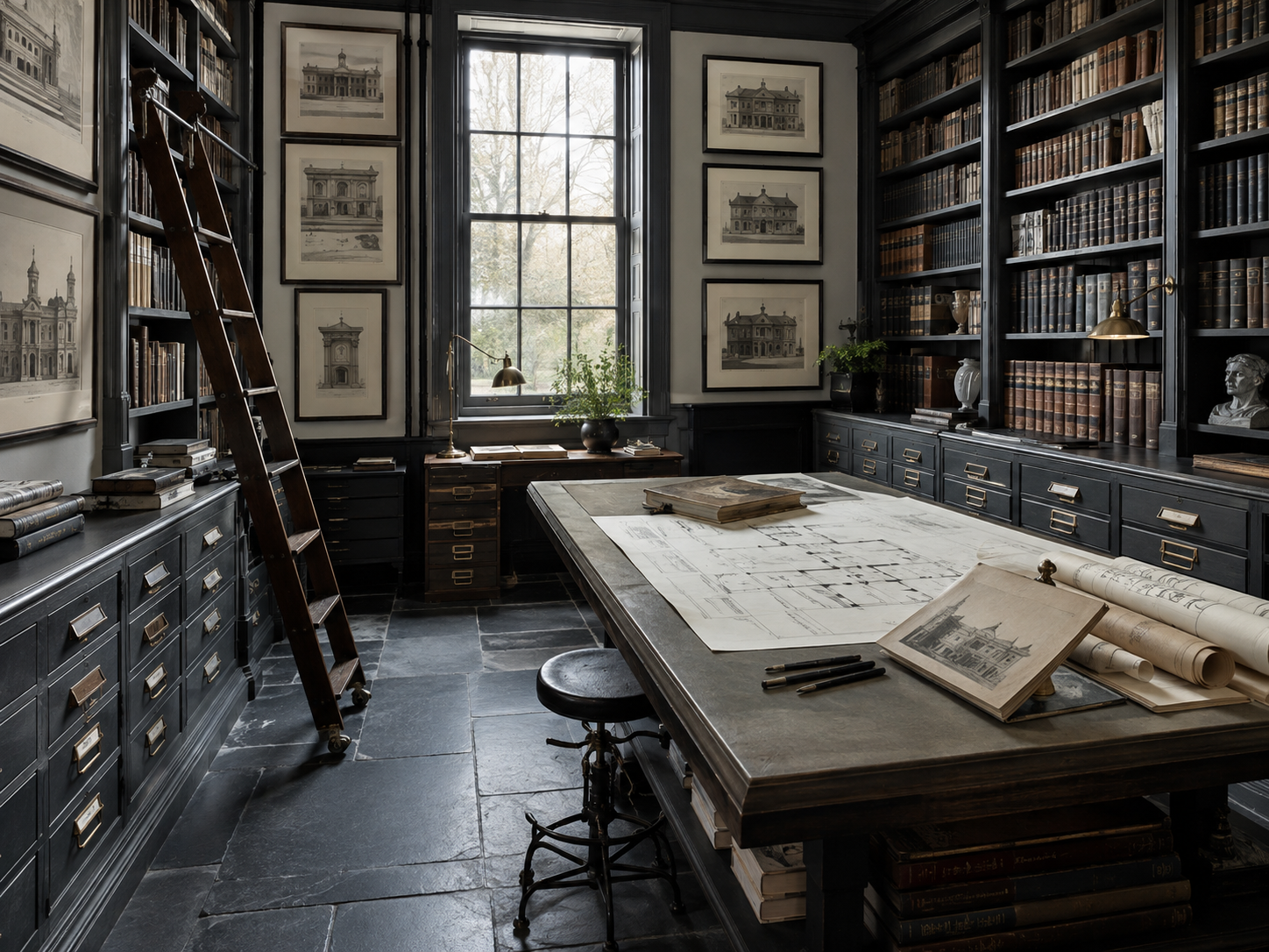
The study at Ashcroft has one window, it faces north-east, and from November to February it gives up shortly after three. When I took the room on, the walls were oatmeal — chosen, I assume, by somebody who had read that pale colours make a small room feel larger. They do not. In poor light oatmeal does not read as cream. It reads as grey with an apology in it, and a wall that is apologising is a very tiring thing to sit next to for six hours.
So I painted it the colour of a storm coming over the hill behind the kitchen garden: a grey with a great deal of green in it, and just enough black to stop the green being pleasant about it. Shelves, shelf backs, skirting, architrave, the inside of the shutters, the back of the door. Everything but the ceiling, and then, four days later, the ceiling. Six people have since told me the room is gloomy. Every one of them said so from the doorway, and none of them said it again after twenty minutes in the chair.
I. What a pale room is actually doing
A pale wall does not make light. It can only give back a portion of what arrives, and in a north room what arrives is not much. What you get is a large, even surface reporting the shortfall to you all day, in a flat grey that changes only by getting worse. That is the mechanism behind the gloom people blame on dark paint: the gloom was already in the room, and the pale walls were being scrupulously honest about it.
A pale room in poor light is not bright. It is a large surface keeping a running account of how little light there is.
A dark wall declines the job. It gives back almost nothing, which sounds like a loss and is in fact the whole trick: with the walls out of the argument, the eye stops measuring the room and starts looking at the things in it. The shortfall is still there. You simply stop being told about it every time you glance up.
There is a number for this — light reflectance value, a nought-to-a-hundred scale that paint companies print in very small type. Below about ten a colour is doing what mine does. I mention it only because it is the one piece of arithmetic in the whole business, and because it lets you ignore the name on the tin, which is usually somebody's idea of a joke about a bird.
II. Why the books thank you
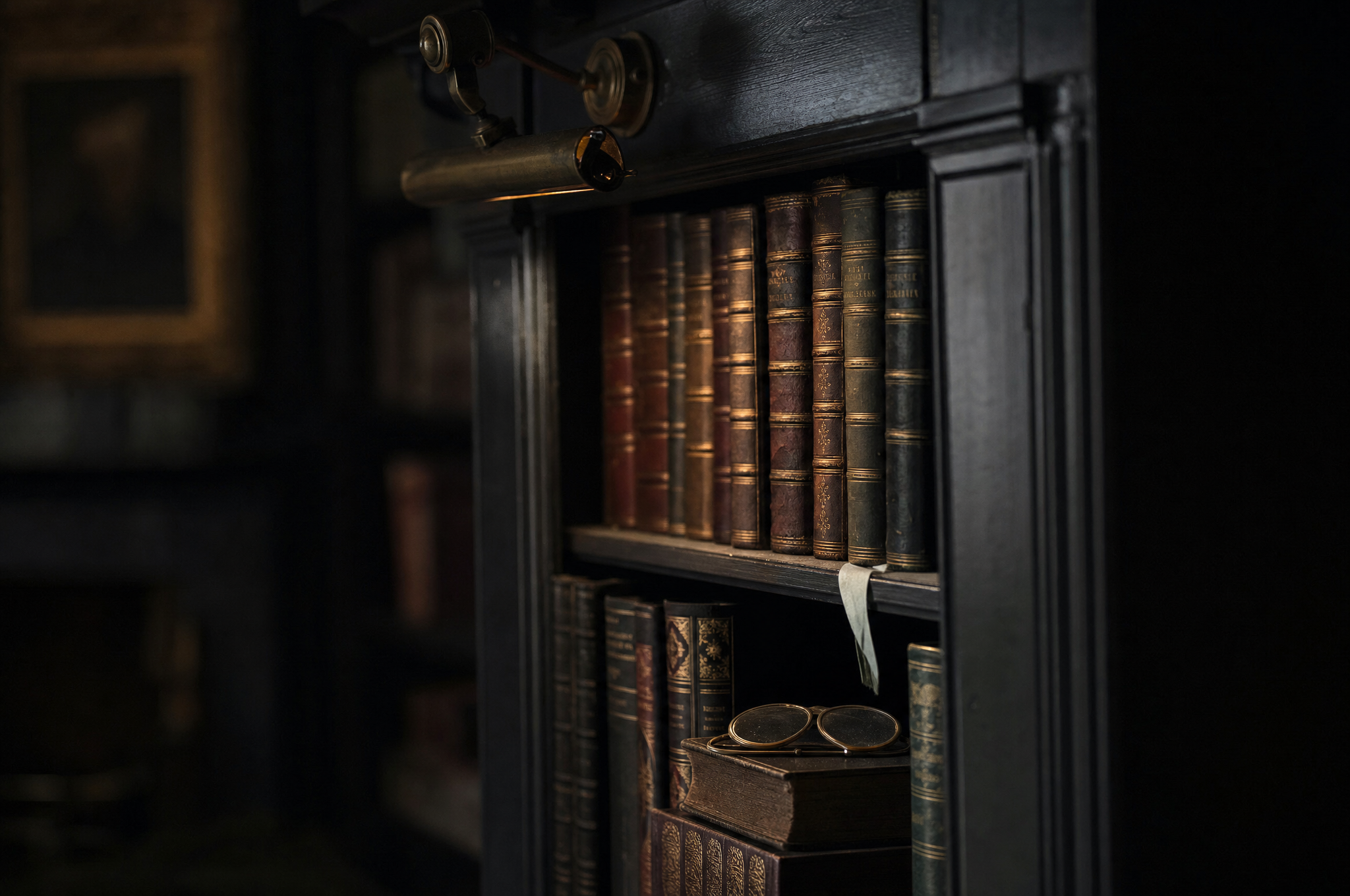
Books are not one colour. They are ox-blood and tan and a dozen exhausted greens, and about a third of them have gilt on the spine that has been waiting since 1880 for somebody to point a light at it. Set that against oatmeal and the eye reads the whole wall as one busy, slightly grubby texture — clutter, filed. Set it against a dark ground and every spine separates. The reds come forward. The greens go quiet and deep. The gilt does the only thing gilt has ever wanted to do, which is catch light at a raking angle and look expensive about it.
This is not a discovery of mine and it is barely a discovery of the Victorians. Dark greens, maroons and chocolate browns ran through nineteenth-century interiors for reasons that were partly fashion and partly the fact that a house lit by coal and gas was a house being slowly kippered; a dark wall forgave both the soot and the plasterwork underneath. But the effect outlived the excuse. Go and look at Soane's Library-Dining Room at Lincoln's Inn Fields, deep Pompeian red, a colour he brought home from the Grand Tour like a stolen sample — and it is not gloomy. It is dense. Everything in it is legible because the walls have agreed to be a background. The whole house is worth the argument, but that room is the demonstration.
The mistake I see most often is a dark room with pale shelf interiors. Somebody paints the joinery a handsome charcoal, leaves the backs the old white, and turns every shelf into a lit box hovering in a hole. Paint the backs. It is a tedious afternoon with a small brush and it is the difference between a wall of books and a wall with books stuck on it.
III. A dark room is a lighting decision
Here is where the people who hate dark rooms are right, and they are right more often than they know. A dark room with one fitting in the middle of the ceiling is a cave, and it has earned every unkind thing ever said about it. Overhead light in a pale room is merely unflattering. Overhead light in a dark room is a small interrogation.
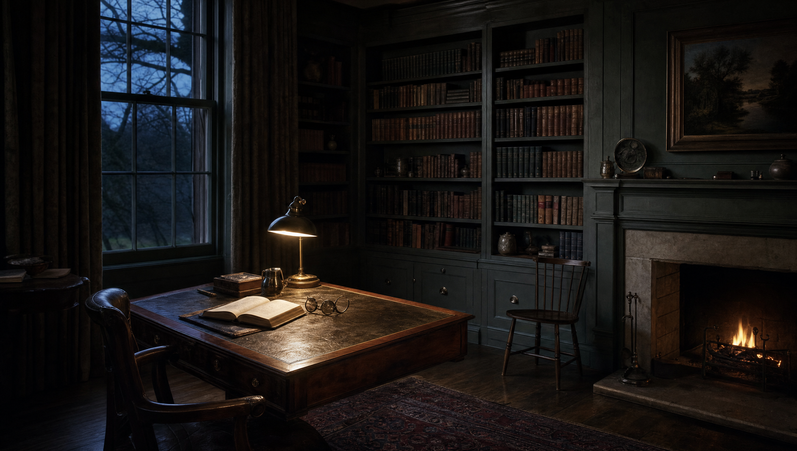
What a dark room wants is four or five low pools and nothing at all above head height: a lamp at the writing table, a picture light over the shelves, something on the chimneypiece, something low in the far corner doing nothing but keeping the corner from being a void. Warm bulbs, and warmer than you think — the same light that looks sentimental on white plaster looks simply like evening on a dark wall. The switch in this room turns on nothing overhead. There is a rose in the ceiling with a bulb in it and I have not used it since March, which is a subject I have gone on about elsewhere at greater length than anyone asked for.
Dark walls are cheap. The lamps that make them work are not. Budget accordingly, and buy the paint last.
Sheen matters as much as shade. Anything with a gleam in it will hand you back a hard grey rectangle of window every time you turn your head, which is precisely the effect you painted the room to escape. Flat, chalky, faintly powdery to the hand. It marks. Let it. A dark matt wall takes a scuff the way a good coat does, and a room that cannot be touched is not a study, it is a display of one.
IV. Generous, not gloomy
Gloom is not darkness. Gloom is the absence of anything worth looking at, and a pale room can manage it beautifully. What a dark room does is hand the whole of your attention to the four or five things you chose to put in it — the spines, the plaster cast, the barometer, the one good drawing, the lamp itself. It is the most generous thing a room can do, and it does it by shutting up.
It is not right everywhere, and I have the evidence. I tried the same colour in the small bedroom over the porch, where there is nothing to look at and nothing to do but sleep, and the result was not atmospheric, it was bereaved. A dark room with no purpose is just a small room in mourning. The colour works in the study because the study is where I sit still for four hours at a stretch; it would be an affectation in a corridor and a cruelty in a kitchen.
And there is one more thing dark rooms give you that nobody mentions in the paint charts. Sit in this one at half past four in November, lamp on, fire going, the window a rectangle of failing blue at the edge of your eye, and the weather stops being something happening to the house. It becomes part of the furniture. Storms are considerably better company when the walls have already agreed with them.
The tin is still in the cupboard under the stairs, about a third full, and I am keeping it for the touching-up I will be doing for the rest of my life. It was the cheapest decision I have made in this house and the only one that changed how long I stay in a room.

Bea is a curator and writer, and keeps the Museum Directory. Letters explaining that the room is too dark are read by lamplight and enjoyed.
The colour was mixed to a chip of skirting board found behind a cupboard in this house, and has no name that would be of any use to you. Match your own wall, in your own light, and ignore the chart.